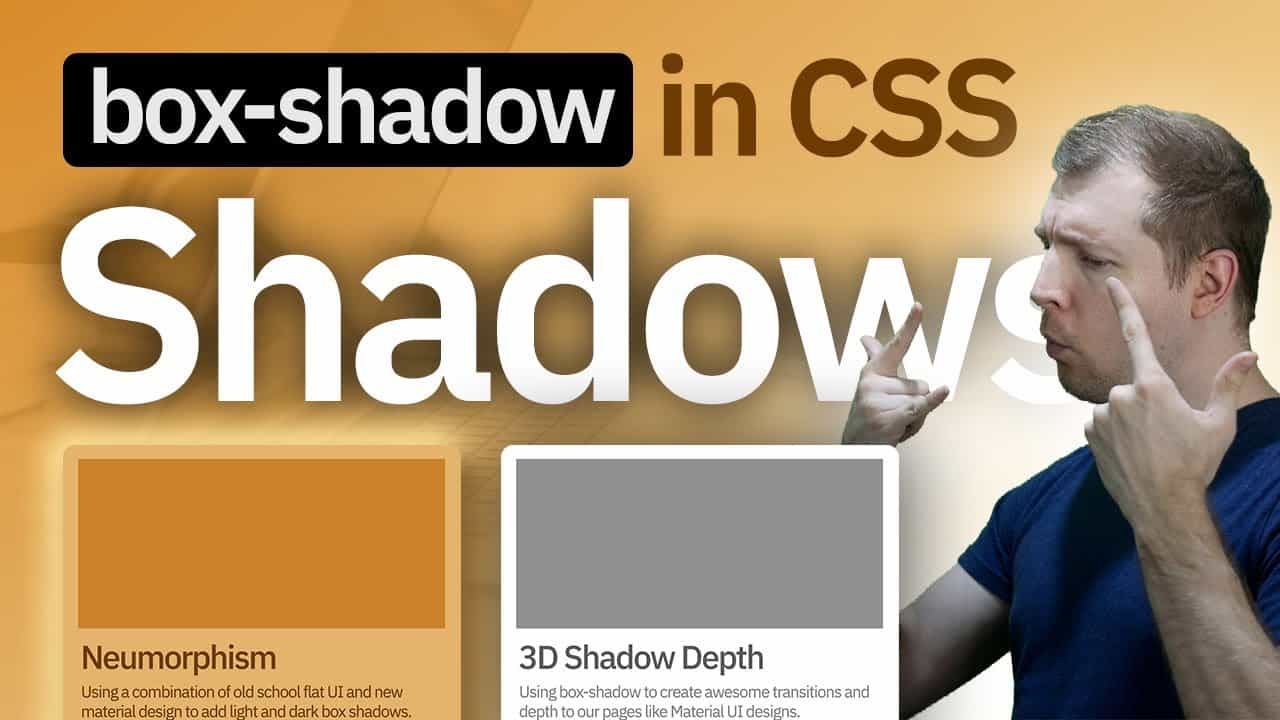
CSS Box-Shadow Effects, Depth, Transitions & Neomorphism
The goal of this video is to show you how to perform different types of CSS box shadow effects. This includes things like adding box-shadows to provide depth to your elements (similar to material ui). This tutorial will also take a look at the way we use the X and Y axis for shadows, adding blurs, and how to transition the shadow on hover. This guide will use CSS3 to provide 3D like movement on our page where elements feel like they lift up above the HTML body, or get closer to it, improving our UX experience using box shadow CSS. We also take a look at neomorphism in UI, which is essentially is applying different types of shadow effects to our elements to create a new look of depth and flat UI.
Material UI: https://material-ui.com/
Mozilla Web Docs: https://developer.mozilla.org/en-US/docs/Web/CSS/box-shadow
#css #boxshadow #neomorphism
source

