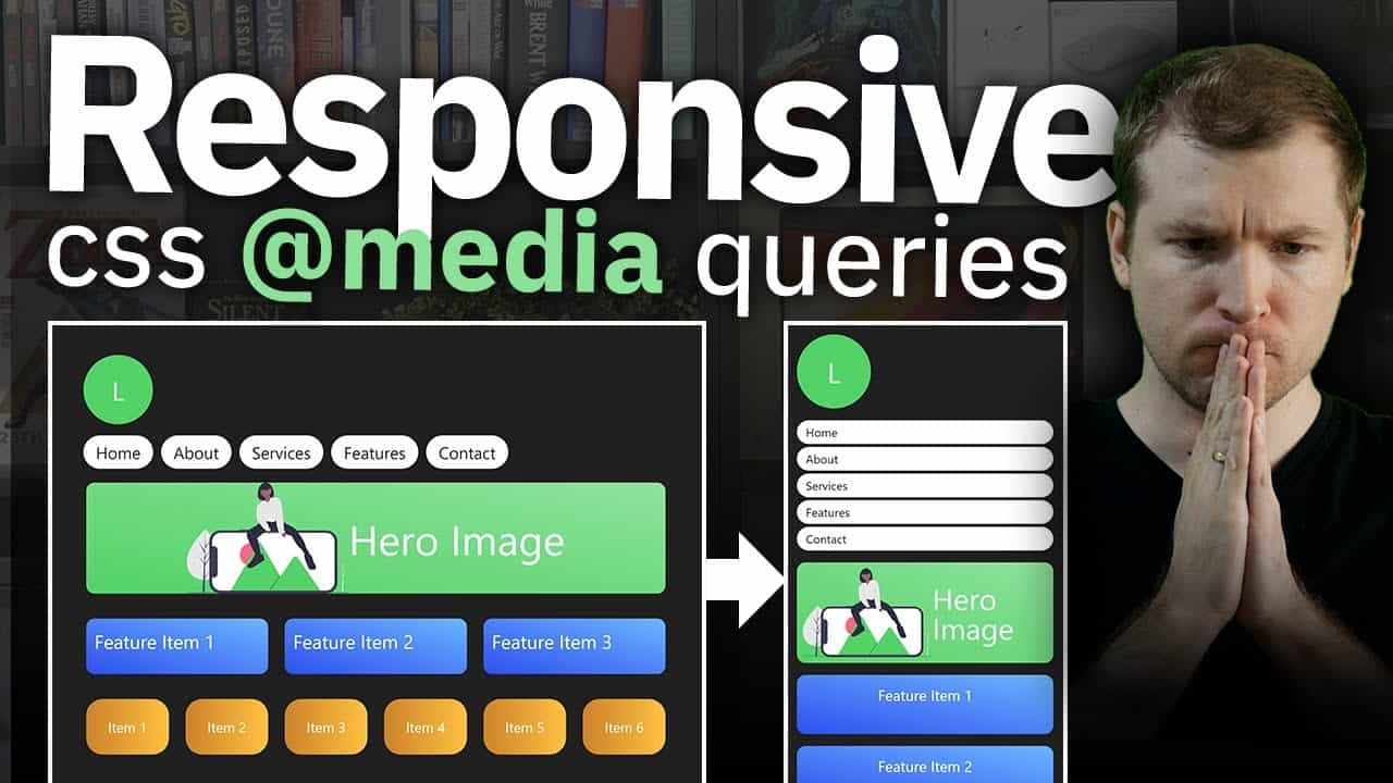
Learn how to do CSS Media Queries with the latest techniques of calling @media, max-width, min-width to allow your HTML code to automatically adjust its responsive design.
We take a look at media queries responsive web design standards that are used in real-world sites daily. Responsive design similar to bootstrap is important to know especially when you have to make it yourself in situations you aren’t using bootstrap responsive layouts.
This Html media query tutorial using css3 is easy and hopefully, this video will show you how to do it.
Design for Developers – Enhance UI
A book I’ve created to help you improve the look of your apps and websites.
📘 Enhance UI: https://www.enhanceui.com/
Follow and support me:
Patreon: https://www.patreon.com/adriantwarog
Twitter: https://twitter.com/adrian_twarog
Dev.to: https://dev.to/adriantwarog
#css #responsivedesign #mediaqueries
source

