Get access here: https://kerjemtec.com/how-to-keep-divi-column-layouts-on-mobile-view-using-css/
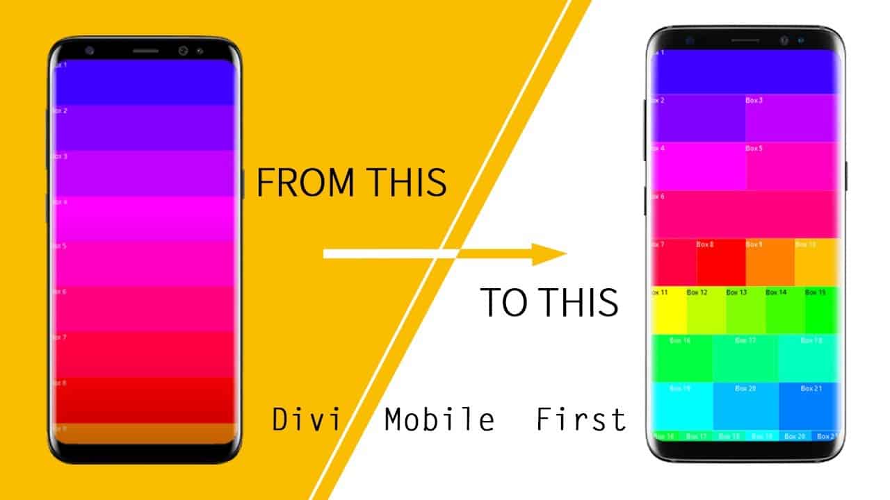
In this video you will see exactly how I use CSS to keep ALL the desktop columns and rows in Divi Mobile. Divi’s default grid layout for the phone view is always 100% in width. While this may not be a huge issue for most developers, it does create some limitation especially for the creative UI designer, who chooses to build websites keeping the mobile first concept mind. In this video I will show you one of the tricks I use as a web developer to transform the default mobile view using only CSS.
Quick Fix and Tips for WordPress Web Development
Kerjem Web Studio
source

