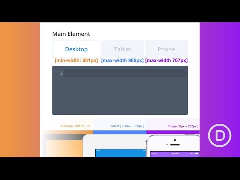
Divi has built-in responsive design editing that makes it extremely easy to adjust the style of your website on desktop, tablet, or phone display (without knowing CSS). Part of Divi’s built-in responsive editing includes a simplified method for making more advanced responsive design changes using custom CSS. This is much more convenient than having to rely on an external style sheet with media queries. You can even make adjustments to the CSS visually in real time for each of the device displays, taking much of the guesswork out of responsive design.
In this tutorial, I’m going to show you how to make convenient responsive design changes using custom CSS so that you can make advanced design touch ups that may not be available in Divi’s built-in design options.
Read more: https://www.elegantthemes.com/blog/divi-resources/how-to-use-divis-built-in-custom-css-inputs-for-advanced-responsive-editing
source

