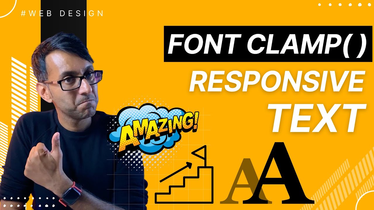
Using Elementor’s breakpoints for Desktop, Tablet, Mobile Font Sizes is fine but you will notice jumps in the fonts as you shrink and grow your page size.
How can you make it more responsive?
With… FONT CLAMP!
And this video will take you through HOW and WHY 🙂
Here’s a Free Tool to massively help you with the Clamp Code:
Make your Fonts Responsive with Font Clamp – Shrink and Enlarge – Elementor WordPress Tutorial
We love to create – share – respond – and deliver.
🧐 Learn with our Mastery Modules:
🔗 All of our Important Links:
😃 Join our Facebook Group:
😃 Get Code Snippets Pro:
😃 Get Elementor Pro:
😃 Boost your YouTube Analysis:
👕 Get our Merchandise:
🥹 Support us:
Hire us to work on your Website!
💌 [email protected]
👩💻 Visit
source

